CLARENDON
-
FACTS/HISTORY
-
Released in 1845 by Fann Street Foundry
-
The designer credited is Robert Besley
-
A partner is a foundry engraved by punchcutter Benjamin Fox
-
Slab serifs are popular British lettering
-
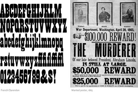
Popular in many parts of the world (American old western wanted posters)
-
Released by Monotype in 1935
-
Reworked to what it now is in 1953 by Hermann Eidenbenz
-
-
BOTH
-
Classic display face
-
Clarendon is used for display on signage
-
Architectural lettering
-
Posters
-
Popular wood type
-
Used by Sony
-
-
CHARACTERISTICS
-
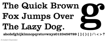
Slab-serif
-
Bold
-
Solid structure
-
Similar to modern serif typefaces’ structure
-
The capital ‘R’ has a curled leg and there is ball terminals on the lowercase ‘a’ and lowercase ‘c’
-
There is less contrast in the stroke weight
-
Plain, sturdy,
-
strong bracketed serifs
-
Vertical stress
-
Large x-height
-
Short ascenders and descenders
-


